Audit · Dev collaboration · Production at scale
Audited a Razorfish component system, coordinated fixes across two dev teams, and shipped 300+ live pages for one of the Midwest's most recognized grocery brands.
![[PLACEHOLDER] Hy-Vee Digital Magazine hero — full-bleed editorial spread](/images/hero-hyvee.jpg)
- Role
- Senior UX Designer
- Timeline
- April 2024 – November 2024
- Scope
- 25 components · 300+ live pages
![[PLACEHOLDER] Desktop magazine article layout — hero and body columns](/images/role-timeline-scope.jpg)
The setup
Taking 20 years of print content to the web.
Hy-Vee is a Midwest grocery institution with over two decades of print magazine content. When the decision came to take that editorial catalog fully digital, the design work had already been completed. Razorfish had built out a component library in Figma. What hadn't happened yet was putting that system through the pressure of real content and production implementation.
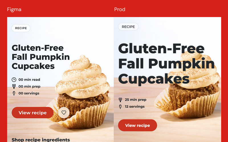
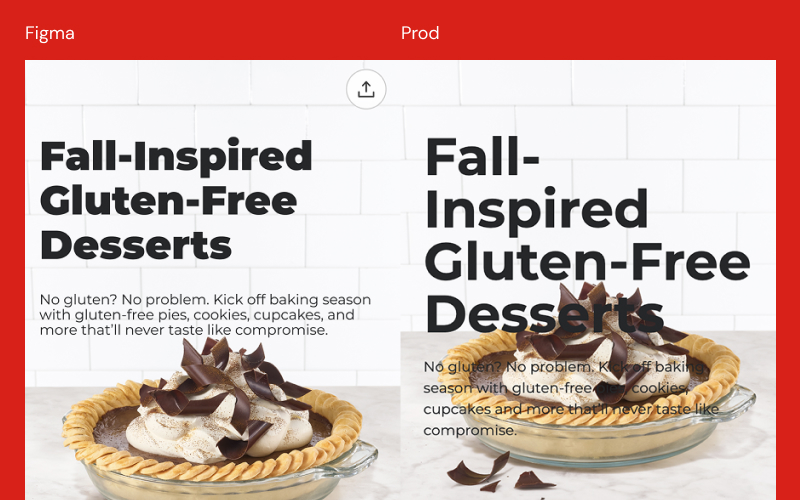
The build involved two separate development teams working in somewhat isolated environments, one focused on the web platform and one building the native app. Components were being built in Sanity CMS against the Figma designs, but without a dedicated resource bridging design intent and production reality, gaps were accumulating across both builds.
My role was to close that distance. Audit the Figma components against live code, surface and prioritize the issues, coordinate fixes with both teams, and build out 300+ editorial pages with real content to get the platform to launch.
My role
Responsibilities and constraints.
What I owned
- Auditing 25 components for accuracy between Figma specs and live code across web and app builds
- Creating a priority structure for the issues surfaced, ensuring the most significant problems were addressed before launch
- Coordinating directly with two separate development teams to communicate and resolve component discrepancies
- Building 300+ editorial pages in Sanity CMS using the component system with real-world content
- Advising the content team on component usage, image sizing, and text settings to get the best results from each component
Constraints
- Components were designed by Razorfish before I joined — the system was inherited, not built from scratch
- Two isolated dev teams meant web and app builds diverged in places, requiring separate coordination tracks
- Image sizing discrepancies between web and app breakpoints created recurring content conflicts with no single owner
- The editorial calendar created a fixed launch target that the audit and build had to work within
![[PLACEHOLDER] Wide screenshot — design system documentation overview](/images/component library.jpg)
Decision 01
Audit before building anything.
The first instinct on any inherited system is to start building. The more useful move was to map first. Every component was checked against the Figma specs and live code across both the web and app builds before a single page was assembled. The audit surfaced three categories: components that matched the spec, components that had diverged in production, and gaps where the two dev teams had resolved the same problem differently.
That mapping dictated the order of work. Fix the broken before building the missing. It also gave both dev teams a shared picture of where things stood, which made conversations about fixes faster and less ambiguous.
Decision 02
Prioritizing what got fixed first.
The audit surfaced over 15 component issues ranging from minor padding inconsistencies to more significant problems like image sizing mismatches between web and app breakpoints. Not everything could be resolved before launch, and the timeline wasn't flexible. A priority structure separated critical issues from acceptable ones, so both dev teams knew exactly where to focus.
The major issues were addressed before launch. Some smaller inconsistencies shipped with a clear plan for post-launch resolution. Making that call explicitly, rather than leaving it ambiguous, kept the build moving without letting quality quietly erode.
Decision 03
Defining what the component library needed to say.
The content team would be operating this system without a designer present. That meant the documentation needed to be scoped for editors, not developers — answering practical questions about usage rather than technical ones about construction. Proposing that scope and building it out was a core part of the engagement.
The guide covered each component and its variations with use cases, accessibility notations for text overlaid on images, optional and toggleable elements, color customization options, padding and spacing notations, and good and bad usage examples — enough for the content team to make sound implementation decisions on their own.
![[PLACEHOLDER] Full-width desktop article — hero, body, and related content](/images/decisions.jpg)
The work
The system as intended.
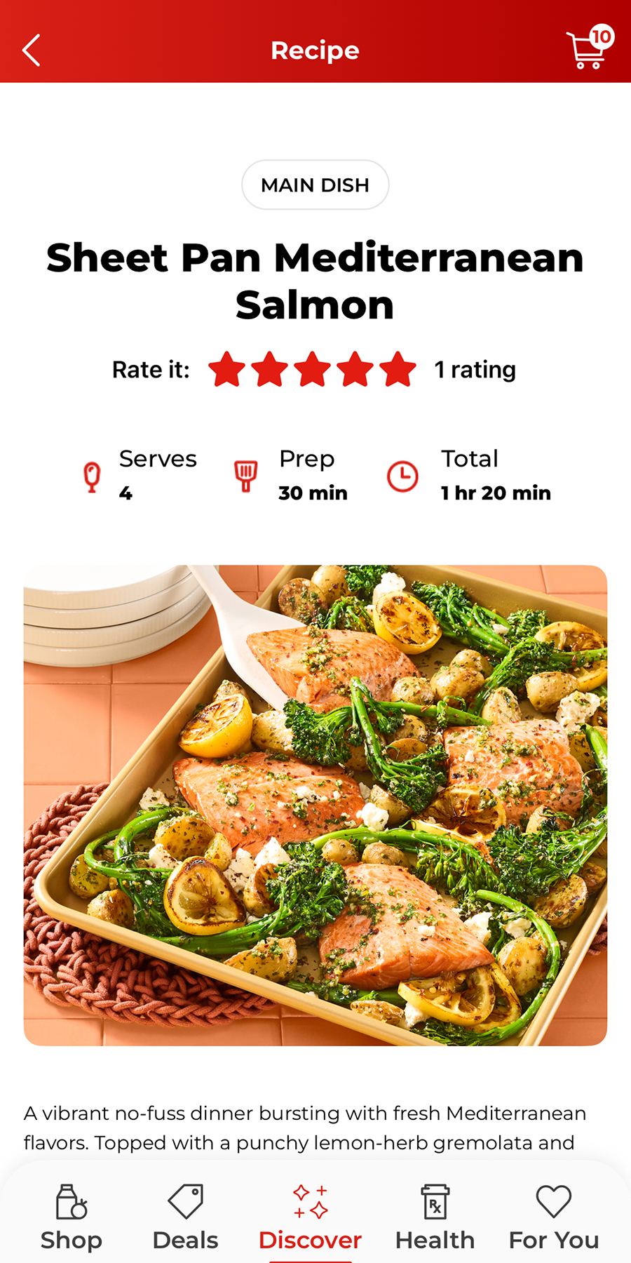
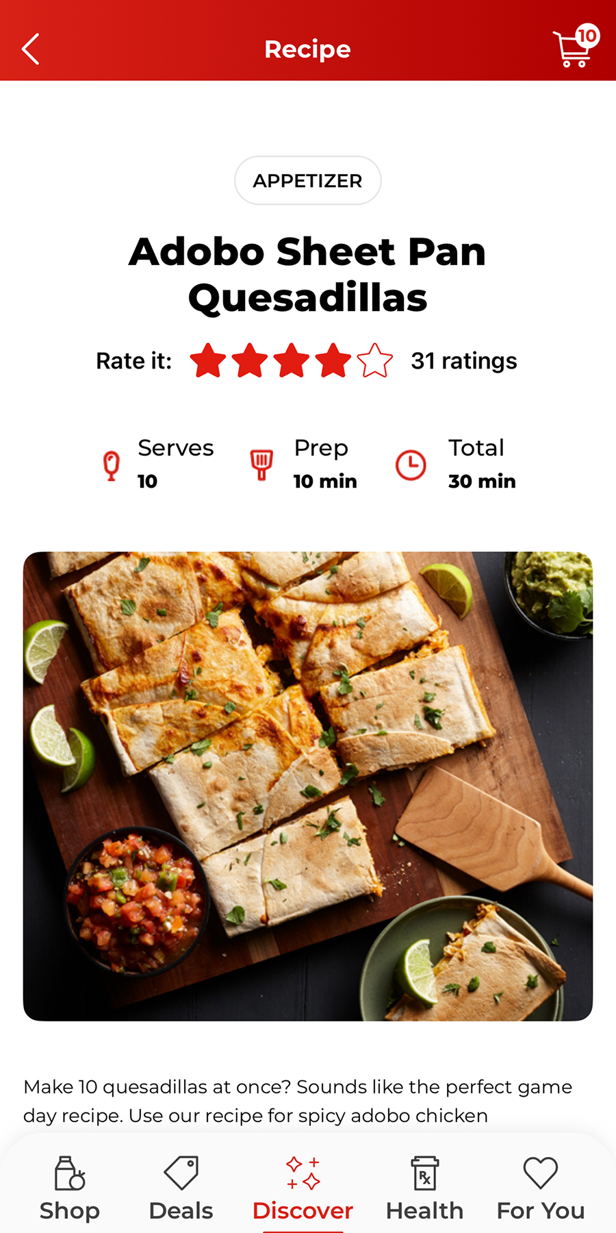
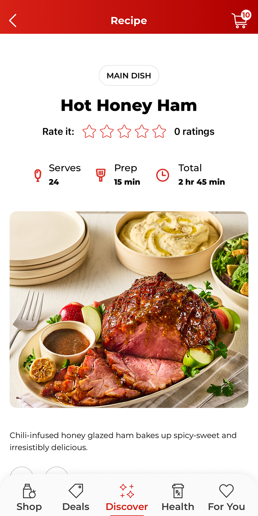
Frames from the app as we tested components with live content.
Outcomes
What the project delivered.
- 300+
- Pages built across the project
- 25
- Production components
- MoM↑
- Traffic growth, post-launch
- The platform launched on schedule, just ahead of the Thanksgiving holiday — a critical window for a major regional grocery brand.
- The component library gave the content team enough clarity to operate the system independently after launch, without needing design involvement for every publishing decision.
- Month-over-month traffic and engagement grew following launch, validating the decision to prioritize a clean, content-resilient implementation over speed.
Aug 25 – Sep 28 · month-over-month
Reflection
If I were to do this again, I'd push earlier for alignment between the mobile web and native iOS component specs. In practice, image sizes and layouts diverged between the two surfaces, which meant many pages had to be built twice. That's avoidable rework that cost the team real time. The deeper issue was a content modeling gap. Most components were built with a single URL field, but the app and web environments route links differently. We didn't surface that requirement early enough in the design process, and by the time it became a problem, we were already in production. In hindsight, a more structured discovery phase that mapped content objects to their properties across both surfaces before component design began would have caught this. If you're designing components that need to live in multiple environments, the data model has to be part of the conversation from the start, not an afterthought.