Brand · IA · Ecommerce · End-to-end ownership
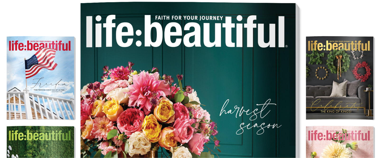
Led the full redesign of a lifestyle magazine's digital presence, rebuilding its information architecture and launching a live ecommerce channel with AI imagery now published in print.
- Role
- Lead Designer
- Timeline
- October 2025-February 2026
- Scope
- Full redesign · Research to launch · IA · Brand identity
The setup
Rebuilding the digital presence of a brand that had drifted from its audience.
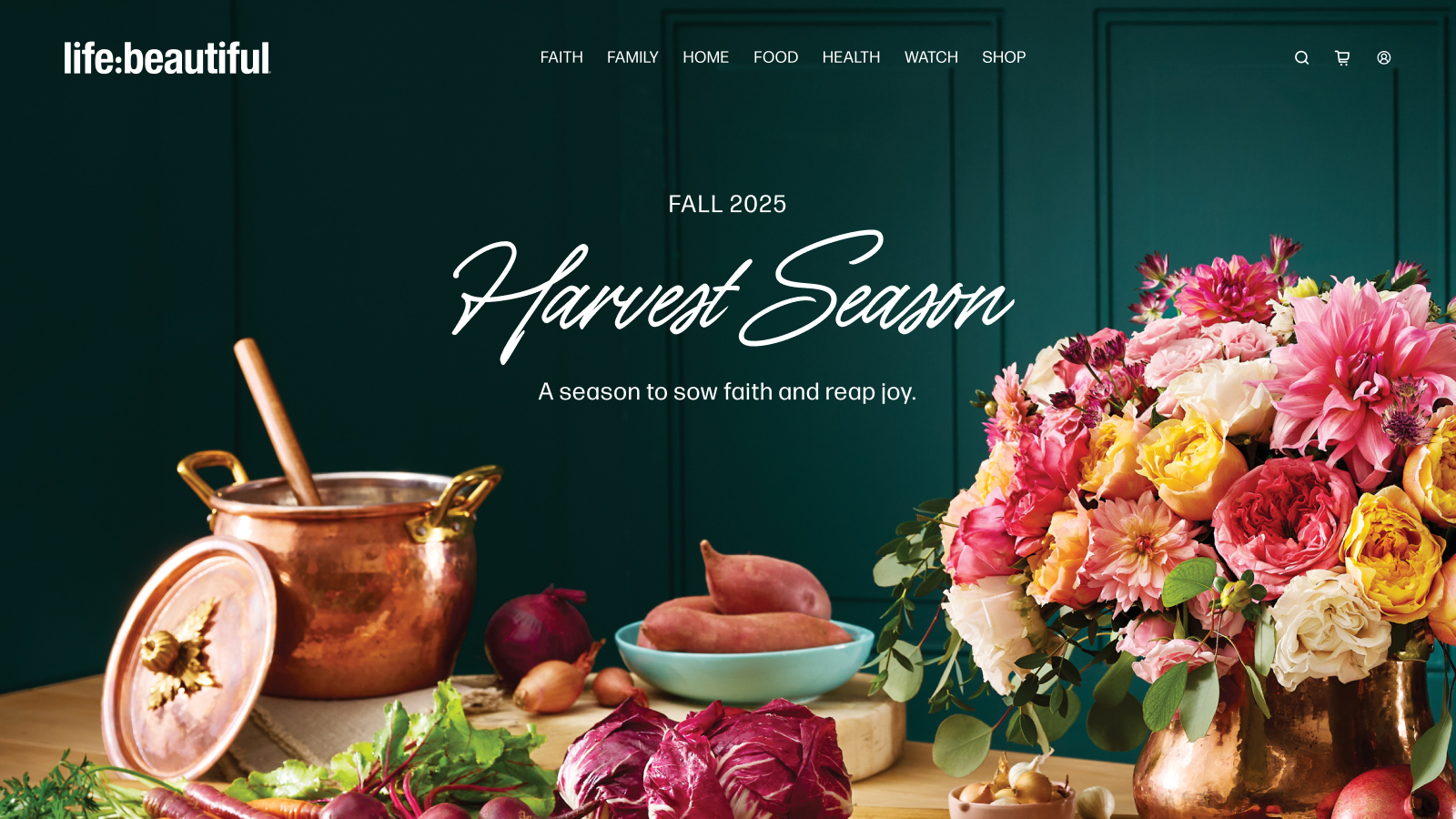
At its peak, Life:Beautiful reached over 100,000 subscribers. The editorial voice was strong. The readership was real. What had eroded was the connection between the brand and the people it was built for. The digital experience was a significant part of why.
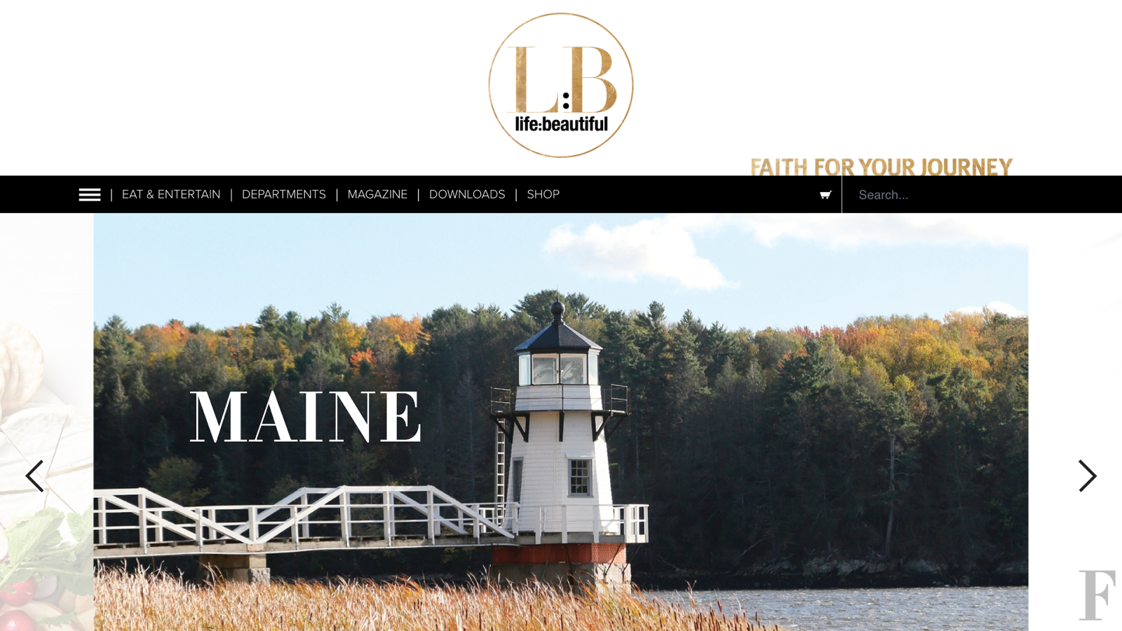
The site was visually dated. Layout and typographic decisions that once felt intentional now undermined the brand's credibility. Navigation was the deeper problem. The information architecture made content hard to find and the site difficult to explore, creating friction exactly where a content-driven brand can least afford it.
The goal was not reinvention. It was reconnection. Giving an established brand a digital experience worthy of the audience it was trying to win back.
The project introduced a second dimension alongside the editorial redesign. The client wanted to sell branded apparel directly through the site, bringing ecommerce into what had been a purely editorial experience. Our team helped define the full scope with the brand's voice and target audience as the anchoring constraints throughout.
My role
What I owned
What I owned
- Competitive research across digital lifestyle and magazine sites to establish design and navigation standards
- Stakeholder conversations with customer service to surface the most common user pain points and navigation issues
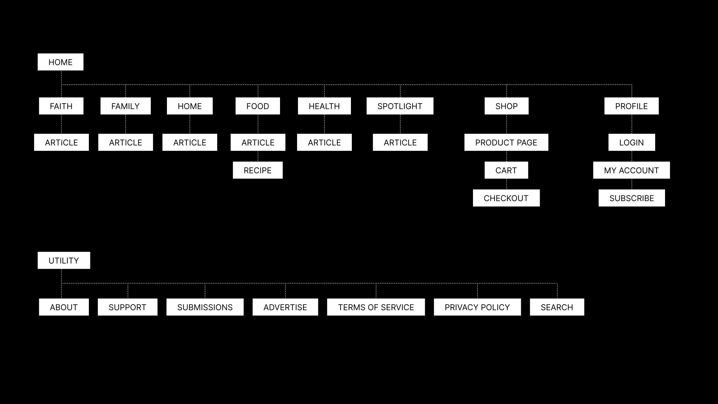
- Information architecture and sitemap, restructuring the full content hierarchy from the ground up
- Brand identity guidelines defining typography, color, and visual language for the redesign
- Wireframing and user flow documentation
- High-fidelity design across all page types
- Webflow build and production implementation
- Shopify integration for ecommerce functionality
- Omeda integration for subscription management, content metering, and paywalling
- AI-generated product imagery using Krea, produced for both the live site and print publication
Constraints
- Omeda's checkout and subscription forms were constrained by available platform templates, requiring design work within their system to approximate brand aesthetics.
- No product photography existed for the branded apparel line, with no budget or timeline to commission it
- The project did not have the runway for formal user research. Decisions were grounded in competitive analysis and customer service feedback instead of direct user validation.
- The redesign had to account for years of existing content. New layouts and components needed to work with legacy image assets and copy that could not be retroactively reshot or rewritten.
Decision 01
Research the landscape before redesigning anything.
The first move was not opening Figma. It was spending time with the competitive set: digital lifestyle magazines, editorial sites, content-subscription platforms. Looking at how they handled navigation, content hierarchy, typography, and layout.
That research did two things. It established a baseline for what works in the category, which grounded the IA and design decisions that followed. And it surfaced where people were breaking conventions effectively, which made it easier to take deliberate swings rather than just defaulting to what felt safe. Going in without that context risks designing something that feels fresh on its own but unfamiliar to the people actually using it.
Decision 02
Fix the architecture before touching the visuals.
Navigation was the site's most significant functional problem. Poor information architecture had made content hard to find and the overall experience difficult to explore. No amount of visual refinement was going to fix that.
The sitemap and information architecture work came before any high-fidelity design. Content was restructured around how the audience would actually look for it, not around how it had historically been organized. User flows mapped the critical paths: subscription, content discovery, product purchase. That gave the design decisions a functional foundation to build on. Visual design followed structure, and that sequence mattered.
Decision 03
Treat AI imagery as a production tool, not a workaround.
The apparel section was the last piece of the project, and by that point the timeline was tight. There was no budget for a proper shoot and no time to book one. The plan was to use AI-generated imagery to get the product pages live and revisit with real photography once the content team had breathing room.
That is where my prior experience with Midjourney, Krea, and ComfyUI came in. The task was essentially art directing a fashion shoot through a generative workflow, iterating on lighting, styling, and composition until the images felt consistent with the Life:Beautiful aesthetic rather than generic. The bar was not perfection. It was good enough to ship and hold the space.
The images ended up clearing a higher bar than that. They were used in print before the site even launched, and when the time came to revisit the photoshoot decision, the call was made to stick with what existed. Two print editions have now run those images and I ended up directing several more photo shoots. They are all still live on the site.
The work
The site as launched.
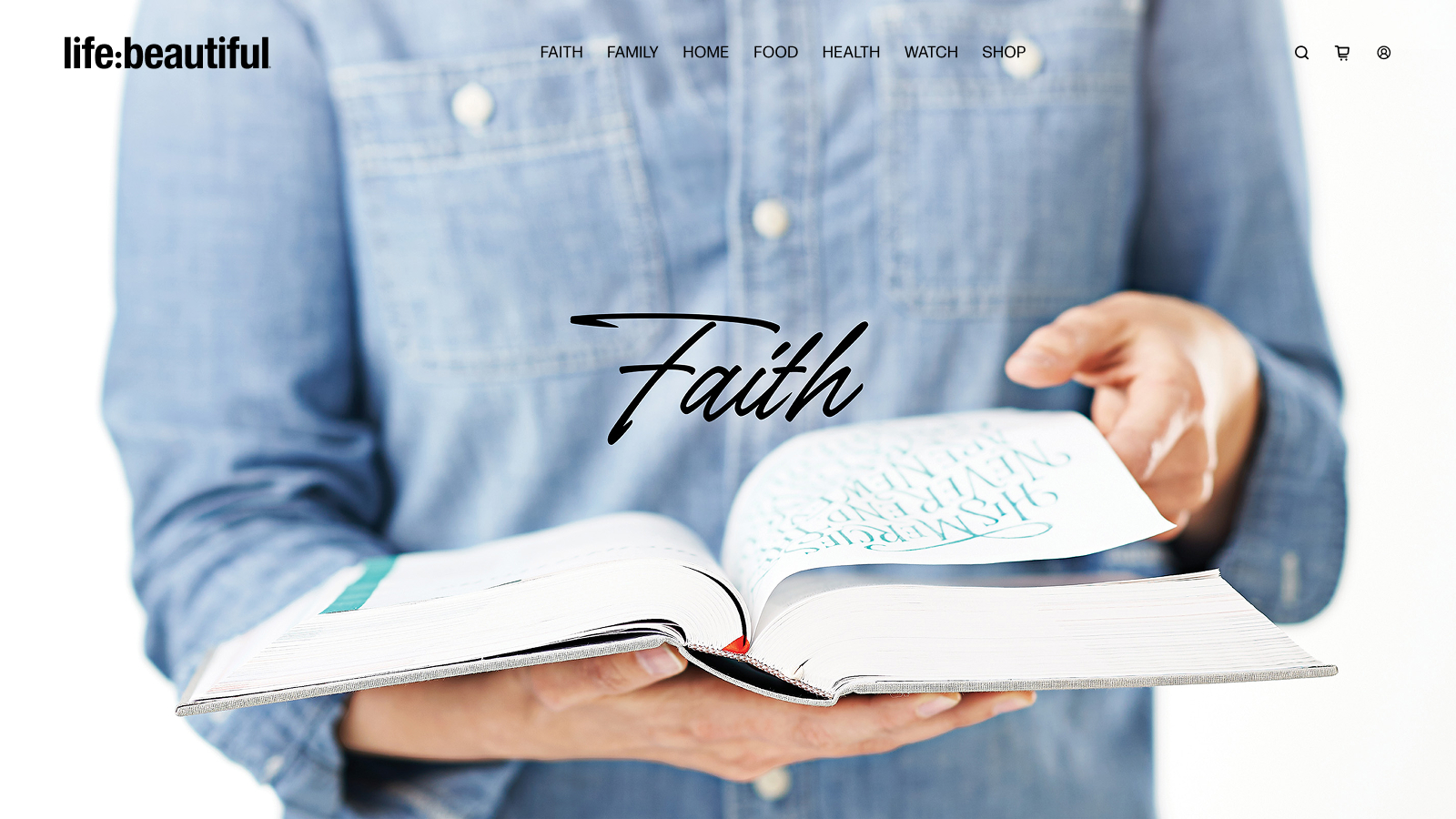
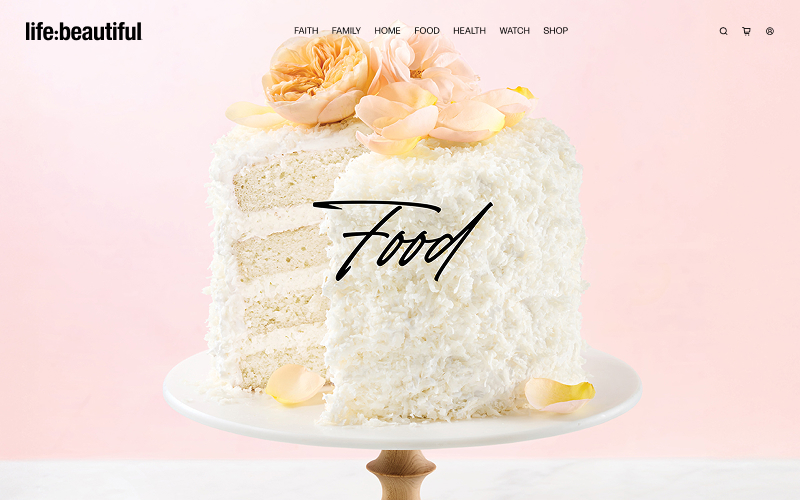
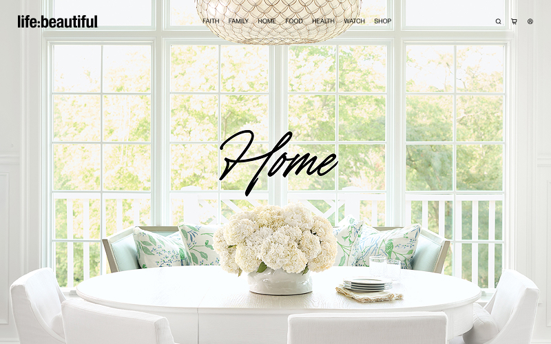
Outcomes
What the project delivered.
- 59%
- Increase in average engagement time in 60 days (1:11 to 1:53)
- 30%
- Increase in engaged sessions per user in 60 days (.57 to .74)
- 1-2%
- Week-over-week drop in customer service contacts (4+ weeks)
- The engagement numbers tell the clearest story. When navigation is broken, people leave. When it works, they stay and come back. A 59% jump in average engagement time and a 30% increase in engaged sessions per user, both within 60 days, point directly to the information architecture and structural work done before a single visual decision was made.
- The customer service trend adds a different dimension. A consistent weekly reduction in support contacts suggests that people are finding what they need on their own now. That is the quieter validation of good IA work. Fewer questions asked means fewer answers needed.
- The project also delivered a competitive analysis establishing category standards, a restructured information architecture and sitemap, a modernized brand identity and design system, user flows across the critical site paths, a full production build with Shopify and Omeda integration, and AI-generated imagery now published across two print editions and live on the site.
Reflection
If I were doing this again, I would push for customer research earlier in the process - even lightweight interviews with existing readers to validate IA decisions and design assumptions before moving into high fidelity. The redesign was anchored in competitive analysis and our team's read of the brand, which produced a strong outcome, but understanding how actual subscribers navigate and prioritize content would have added another layer of confidence to the structural decisions. What I am most proud of is how much ground the visual shift covers: the new site reads as a fundamentally different brand experience while still feeling like Life:Beautiful. Holding that continuity while modernizing aggressively was the hardest thing to get right.